63% Increase in New Patients
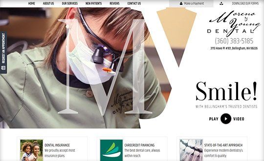
In late 2017, they decided it was time for a change. They wanted something better... something that told their story and would help them convert more of their website visitors into new patients. Little did they know this design would also dramatically improve their search rankings and generate even more website visitors.
The facts are compelling.
Their new website went live in December 2017. During the 60 days prior to launch, they had no important search keywords in the Top 5 listings (and only one on page 1) of Google results for Bellingham, WA. Today, their new website has six #1 listings; 2 more keywords in the Top 5; and a total of 23 page 1 results.
Interestingly, this has translated into a 63% increase in new patient conversions. Moreno & Young Dental’s new website generated 62 phone calls and forms during January and February 2018 (compared with 38 conversions during November and December 2017).
What Changed in their Website Design
Everything started when the leader of TNT’s Video Production Team, Marcus Bellmore, boarded a flight to Seattle. By spending a day with Dr. Moreno, Dr. Young, their team and their patients, we were able to capture the content – images and video – to customize their story. Immediately, this gave us the opportunity to explore the spirit of the practice.
More importantly, it enabled us to tell their story.
The new website features a video introduction to the practice. By featuring this on the opening screen of their homepage, they immediately differentiate themselves from every other dentist in the market. Now, they are cool and high-tech. And, they are the only dentist in Bellingham with video on the homepage of their website. Furthermore, we were able to feature patient stories – how they have helped others – via video and to provide personalized introductions to each doctor. Again, no other practice in their market does this.
The new, open feel of the website creates a completely different first impression. The ever-present calls to action help engage and convert. Nowhere is this more evident than on the mobile version of the website where click-to-call, click-to-request and click-to-find buttons are locked into the “swipe zone” at the bottom of every screen... ready for the thumbs of prospective patients.
Changes More than Skin Deep
In addition to the completely new look and feel, Dr. Moreno and Dr. Young have benefitted from an upgrade to the content and technological underpinnings of their website. For example, important information about how they work with dental insurance and their in-house dental savings plan is now easy to access. There is much deeper content on expanded services – such as sleep apnea treatment – throughout the website.
And, by redeveloping the entire website, we were able to help them earn industry-leading results on the Google Speed Test and to utilize newer technologies such as KMI files and schema code to improve its functionality.


