Over the past 20 years, we have built thousands of custom websites for dentists. In addition, we have studied how patients interact with these websites. We have developed heat zone maps and click counts for millions of website visits. We have held in-person focus groups, and we have tracked click-thru and conversion rates. We have A/B tested hundreds of different photos, headlines, button designs and color combinations.
Plain and simple, we know what works.
Following is a detailed look at the 10 critical components of effective dental websites. These are the difference makers. These are the features that empower websites for dentists to accomplish their 2 primary objectives; convert visitors into patients and serve as the foundation of your SEO.

#1: The Big Opening
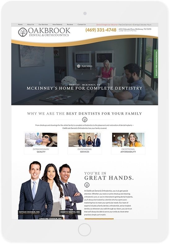
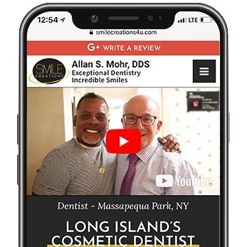
You have 3 to 5 seconds to capture the attention of someone visiting your website. The initial image they see will is a pass – fail test. If they are engaged by what they see, they will spend more time getting to know you. If not, they will hit the back arrow button and continue their search on the websites of your competitors.
Does a generic photo of a stock art family tell your story? Does it differentiate you from the other dentists in your area? Does it appeal to a 35 to 55 year-old female who is looking for a caring professional to take care of her family?
Think of the one image that captures the essence of your practice. Would a video be better at positioning you as the high-tech practice? Personalizing your story? What about the quality and clarity of the photo? If you do not take the time to get this right, it sends an strong message to potential patients that you do not pay attention to the little things.
That opening screen is what every visitor to your website sees immediately. It is how they form their first impression of you and your practice. They have decided what you are all about before they scroll an inch or read a word.
Most importantly, do not think the “big opening” only affects the people searching for a new dentist on the Internet. It impacts every potential, new patient. Even referrals from your best, current patients will go to your website. If this image does not support what they have heard, they may begin to doubt the referral. Is this really the right place for me?
Today’s world is fast-paced. People are busy. They draw conclusions quickly and move on. Photos and videos are worth way more than a thousand words. Make sure the first image visitors see on your website tells your story, differentiates you from your competition and engages. You win if they decide to spend more time on your website. You lose (and never get another chance) if they do not like what they see.

#2: Mobile-Friendly Version
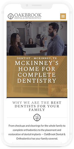
This is simple. The look, feel and function of your website on a mobile device is more impactful than how it functions on a desktop. More than 60% of all visits to dental websites are on mobile devices, and every website should have full mobile responsiveness.
This means it is designed to tell your story and engage visitors on every web browser on every device – regardless of screen size and orientation. The technology is there to make this possible. You website company just needs to use it.
At the same time, mobile-friendliness is more than skin deep. It also means the content on your website must be structured properly. The words on your website must be organized in a way that is easy for Google to index, and they must be presented in a way that is easy for people to find. This is a big change from only a few years ago.
Google used to base its search results on the content included in the desktop version of your website. As a result, many companies would scale-back the amount of content included on the mobile version of your website. The thought was this made things faster to load and easier to navigate. In 2016, this was true.
Today, this is a serious mistake. Now, Google scans and indexes only the mobile version of your website. They do not even look at the desktop version. If the mobile version of your website “hides” a bunch of images and content, Google will never see them. And, your chances of getting on the first page of Google search results will take a direct hit.

#3: Calls to Action
While getting lots of visitors to your website is exciting and looks good on a colorful, monthly report from your Internet marketing company, converting these visitors into actual patients is way more important. This is what we call “butts in the chairs”, and this starts – and ends – with clear calls to action.
This means that your phone number and a “Request an Appointment” button should always be visible on your dental website. Whether a visitor is on your homepage or your “Meet the Dentist” page, these two options for conversion should be locked in place and noticeable. You never want a website guest more than one click away from becoming your next, new patient.
The biggest mistake with calls to action is not having them locked in place. If these features are in the header of your website, your header should be fixed. It should not scroll. If they are fixed on the side of your screen, no problem. Keep them there.
Likewise, we recommend these conversion buttons to be locked at the bottom of every mobile design. Mobile designs will require lots of scrolling to get to your content, however, this “action bar” should never move. This is in the “swipe zone” for people’s thumbs, and placement of the buttons here will generate significantly more clicks (and patients) than if they are anywhere else on the screen. It is true. Watch how people use their phones. Try to reach another part of the screen with your own thumbs. Common sense – and lots of research – proves it.

#4: Custom Photos & Videos
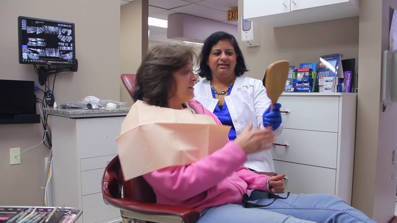
As presented in the “big opening” section, there is nothing more important than custom photos and videos. Your success is founded on people trusting you. How can they trust you if they cannot see you? Do you really want your dental school graduation photo to be their only view of the dentist they are going to select for a $30,000 smile makeover? If your practice offers a team of experts, why can’t they get together for a nice photo?
The simple fact is the inability of your competitors to pose for high-quality photos gives you the opportunity to differentiate yourself. Pick custom photos over stock photos, and you will already look more professional than 70% of the other dentists in your market.
And, it is definitely worth the investment. For less than the value of a single, new patient, every dentist can get studio-quality photos and videos and make them the centerpiece of their website. These images are the first impression you are giving to patients. Make them amazing!
If you need more encouragement, consider a couple of facts.
Less than 16% of all dental websites feature custom photos exclusively, and less than 11% include custom video. Patients will immediately notice the difference. Let your competitors use the stock photos of the middle-aged, “dental implant couple” on the beach. You can simply and easily feature your own patients, your own team and your own practice.

#5: Meet the Dentist
After your homepage, this is the 2nd most-visited page on your website. How does it look? Does it feature your professional accomplishments and education? Does it provide interesting insights and anecdotes? Does it allow patients to connect with you personally?
Do not underestimate the importance of this page. There is a reason it has a lot of traffic. Prospective patients want to know about you – the dentists they are selecting. This page helps them have confidence in that decision.
As mentioned above, it should start with custom photos and videos. Just think how different you would be from everyone else if your “Meet the Dentist” page featured a short video with you thanking patients for considering your office, telling them a little more about yourself and directly inviting them to come in and meet you. Check the websites of your 10 closest competitors. Our research shows no more than 1 or 2 of them will have such a video.
Also, do not forget your patients have no idea how to evaluate the quality of your dentistry. Sure, sharing your credentials is a must. However, more than half of patients select their dentist based on non-clinical factors. This starts with the type of person you are. Are you a mom with kids of your own? Do you love hunting and fishing? Volunteer at the pet shelter in town? Coach a little league baseball team?
These are the opportunities for you to make a connection with potential patients. These attributes are often more important than the latest symposium you attended, and they are definitely more real. Make sure you share them – along with some current photos of you, your friends and your family.

#6: Meet the Team
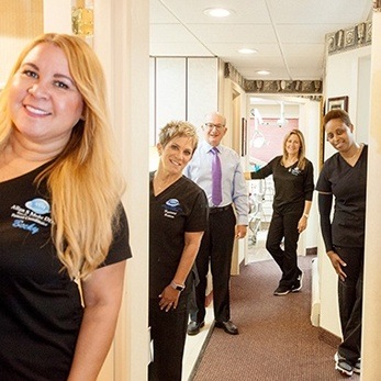
Like the “Meet the Dentist” page, the “Meet the Team” page is not optional. Patients spend more time with your staff than they do with you, and they want to get to know these people. Patients want to look at their faces, judge their character and see if they are the type of people who can be trusted to “put fingers and pointy tools” in their mouths.
During our focus groups, no page generates more discussion. Patients immediately question a dental website without a “Meet the Team” page. Is the staff not trained properly? Is there high turnover? Patients wonder about the quality of dentists who are reluctant to feature the other people on their team. It would be like the coach of a team taking all the credit for himself without recognizing his players.
Do not fool yourself. Patients are smart and intuitive. They notice these “little” things, and they make decisions accordingly. Do not try to cut corners or save money by not investing in a well-developed page featuring professional photos of your team along with in-depth introductions that help patients start building a relationship.

#7: Insurance Information
More than 50% of patients have dental insurance. If your practice is an in-network provider with any insurance plans, your website should state this loud and clear. Even if you are a fee-for-service practice, it is still quite likely insurance plays a significant role in your success. Prospective and current patients want to know this and understand how you will work with them to understand and maximize their benefits.
When thinking of how to present dental insurance on your website, think of 3 things:
- First, share a quick snapshot of how your practice handles insurance on your homepage. If you are in-network, this is a key point of differentiation. Get the benefit of being in-network and feature this information near the top of your homepage. For patients with dental insurance, it is one of the top three decision factors in selecting a dentist. Even if you are not in-network, be welcoming to patients with dental insurance. Many will choose an out-of-network provider, but adversarial, confusing or no information will scare them away.
- Second, dedicate a section of your “New Patient Info” page to a more detailed explanation of how dental insurance works in your practice. It is a great place to feature the logos of the major insurance plans you welcome, and it is an opportunity to convey a sense of friendly expertise. One cool idea is to feature your office’s “insurance expert” on this page. Making it personal and letting patients know there is a real human ready to help them will make a big difference.
- Third, create separate pages for each insurance plan with which you are in-network. This does not have to be part of your website at launch, but it should be included in your on-going SEO campaign. More and more patients are turning to Google (instead of the confusing, inaccurate insurance directories) to find an “in-network Aetna dentist”. There is not a ton of search volume, but each search is very likely to convert. In fact, it is quite possible you will be the only dentist in your area with an entire page dedicated to each of these keywords, and you will have an excellent chance of earning a page 1 listing.
Targeting valuable niches (and winning the related searches) is one of the hallmarks of successful Internet marketing. Including relevant dental insurance information on your website is exactly this type of opportunity.

#8: Custom Services Content
If including insurance content on your website makes sense, the same thought process extends to the clinical services offered by your dental practice. In fact, it is even more important, and there are multiple angles to consider.
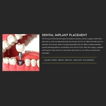
As a starting point, you must understand the role content pages serve within your website. Creating individual pages dedicated to topics such as “dental implants”, “porcelain veneers” and “emergency dentistry” are the only way to win searches related to these topics. Your pages must establish you as an expert on each subject (in Google’s eyes), and these pages must provide useful information to potential patients. We recommend at least 500 words of custom content – along with custom photos and graphics – on each of these pages.
This brings us to the second consideration for service pages. The content must be 100% custom. Most website companies offer a library of “semi-custom” content that is shared by all their customers. This is not custom. Every word should be written exclusively for your practice and tell your story. If the same, “semi-custom” words are found on multiple websites, it is deemed “duplicate content” by Google and is ignored by their search algorithms.
At the end of the day, most patients will land on the homepage of your website. However, there is a subset of “big treatment plan” searches that will not find you without custom services content. These are the searches for the high-value procedures such as “All-on-4”, “smile makeover” and “Chao Pinhole Technique”. Regularly winning just a few of these searches is often what stands between a good month and a great month of production.

#9: Google My Business Integration
Aside from your website, your Google My Business (GMB) page is the most significant component of your Internet presence. It is critical to establishing yourself as a “local” business within the Google universe, and it must be fully-integrated and consistent with your website.
This starts with the set-up and claiming of the page. There are more than 50 questions that must be answered – correctly – and your website must be properly linked within your GMB page. In addition, the location pin for your practice needs to be accurate as it impacts Google searches and GPS directions. Last but not least, the page has to be officially verified.
Along with the direct impact your GMB page has on potential patients finding you via the Internet, it serves as the repository for your most valuable patient reviews. Even though Yelp tries to convince you otherwise every time they bother you, people trust your GMB reviews more than any other source on the Internet. A seamless integration that allows patients to read your GMB reviews and makes it easy for them to leave reviews on your GMB page is critical.
Even if you do everything right and have an amazing website, the strength of the reviews on your GMB page will have a huge impact on the flow of new patients into your practice.

#10: Technical Infrastructure
Let’s face it. This is where you have no chance of knowing whether or not you are getting treated fairly. Just like a patient cannot tell the difference between the quality of one implant system versus another, you have no idea whether or not the technical underpinnings of your website are what they need to be.
This is where trust comes into play. And, having a little knowledge of what questions to ask cannot hurt. Then, you have to trust your gut. The best dental website companies will be honest and transparent. They will provide specific, detailed answers to your questions.
Some of the technical infrastructure that is not optional includes:
- SSL Certificate: This is a must. It is validation your domain is registered properly and is hosted on a secure server. Without it, Google will not send traffic to you, and patients will be warned not to visit your website due to security risks.
- Site Load Speed:
Ignore this at your own peril. At the same time, focus on the Google Speed Test – not the host of others designed just to scare you. At an absolute minimum, your website should score in the 70’s for both mobile and desktop. 80’s are achievable and better. 90’s for desktop are very common. Again, anything in the 70’s and above will not have a negative impact on the performance of your dental website.
- Img Alt Text
This is getting a little into the weeds, but it is not optional. These are the tags / labels that are attached to every photo and image on your website. Their first objective is to provide an accurate description of the image for people who are visually impaired. At the same time, these labels do add value to your SEO efforts. Without them, your website does not meet ADA accessibility standards.
- Schema
We are now in the tall grass. It will be very hard for you to know whether or not your website company is using schema properly. However, it is absolutely necessary. Think of schema as the street signs of your website. They help point Google in the right direction to find important information. Without these signs (schema), Google may not find it at all, and your Internet presence will be negatively impacted.


